SyneHQ turns your words into stunning dashboards and insights—no coding required. This section covers how to build, interpret, and share powerful data visualizations using SyneHQ’s visual analytics features.
- Instant charting: Go from question or query to live charts and insights in seconds.
- Rich outputs: Visuals include bar charts, line charts, pie charts, tables, and more.
- Narrative insights: Each chart comes with automated “takeaway” summaries and context explanations.
- Dashboarding: Arrange, organize, and refresh visualizations to monitor key metrics at a glance.
How to Build Visualizations
-
Ask or Build a Query
- Use natural language (“Show me quarterly investment volume”) or the No-Code Query Builder.
- Review or edit generated SQL for full transparency.
-
Run and Visualize
- Click Run to execute your query.
- Instantly preview results as tables and charts.
-
Choose and Customize Chart Type
- Select from bar, line, pie, or table using the Visualization panel on the right.
- Assign X (dimension) and Y (metric) fields—e.g., Quarter vs. Transaction Count.
-
Automated Insights & Takeaways
- Below each chart, view an AI-generated summary interpreting the trend, anomaly, or correlation.
- Examples: “Investment activity peaked in Q3 2017…”, “Largest negative cash flow from bid acceptance…”
-
Dashboard Mode
- Click Add Chart to organize charts into dashboards.
- Move visualizations onto boards for monitoring by team or use case.
- Use Refresh All Charts to update with the latest data.
-
Export & Share
- Export visuals and data for use in slides, reports, or discussions.
Dashboard
Visualization Types Supported
- Bar Chart: Ideal for time series (e.g., quarterly volumes), category comparisons, and ranking.
- Line Chart: Perfect for trend analysis or visualizing continuous changes (e.g., cash flow impact over time).
- Pie Chart: For proportional breakdowns.
- Table: For detailed, granular output.
- Area Chart: Great for showing cumulative values and part-to-whole relationships over time.
- Scatter Plot: Perfect for correlation analysis and identifying relationships between two variables.
- Composed Chart: Combine multiple chart types (bar + line) to show different metrics on the same view.
- Radar Chart: Compare multiple variables across categories in a circular format.
- Treemap: Visualize hierarchical data with nested rectangles proportional to values.
- Geographic Charts: Display data on maps for location-based analysis and regional insights.
- Sankey Diagram: Show flow and relationships between different stages or categories.
- Heatmap: Reveal patterns and correlations in large datasets through color intensity.
- Funnel Chart: Track conversion rates and drop-offs through sequential stages.
- KPI Cards: Display key metrics with context, targets, and trend indicators.
- Box Plot: Analyze statistical distributions, outliers, and quartile ranges.
- Flexible switching: Instantly toggle between chart types. Icon tooltips describe best uses.
Mapbox Support
 SyneHQ supports comprehensive geographic visualization capabilities through integration with both ECharts and Mapbox/Deck.GL:
Map Types Available:
SyneHQ supports comprehensive geographic visualization capabilities through integration with both ECharts and Mapbox/Deck.GL:
Map Types Available:
- Heatmap: Color-intensity overlays showing data density and distribution patterns
- Cluster: Aggregated point clustering with dynamic zoom-based grouping
- Scatter: Individual data points plotted on geographic coordinates
- Screen Grid: Hexagonal or square grid aggregation for spatial analysis
- Path/Flow: Directional lines showing movement, routes, or connections between locations
- Country Maps: Detailed country-level choropleth visualizations
- World Map: Global choropleth with country-level data aggregation
- Latitude/Longitude Fields: Required for all geographic visualizations
- Country Selection: Needed for country-specific map renders
- Value Mapping: Assign metric fields to control color intensity, point size, or aggregation values
- Dynamic Zoom: Maps automatically adapt detail level based on zoom
- Hover Tooltips: Display data values and location information
- Layer Toggle: Switch between different visualization types instantly
- Export Support: Save high-resolution map images and underlying data
Best Practices & Tips
Best Practices & Tips
- Natural Language + Visuals: Start with simple questions—SyneHQ’s AI interprets intent and suggests the best chart.
- Automated Explanations: Use narrative takeaways to enhance presentations and drive decisions.
- Dashboards: Group essential charts to track KPIs.
- Organization: Use categories, search, and pinned boards for fast access.
- Collaboration: All boards and charts are easily shareable within your team.
Example Gallery
Example Gallery
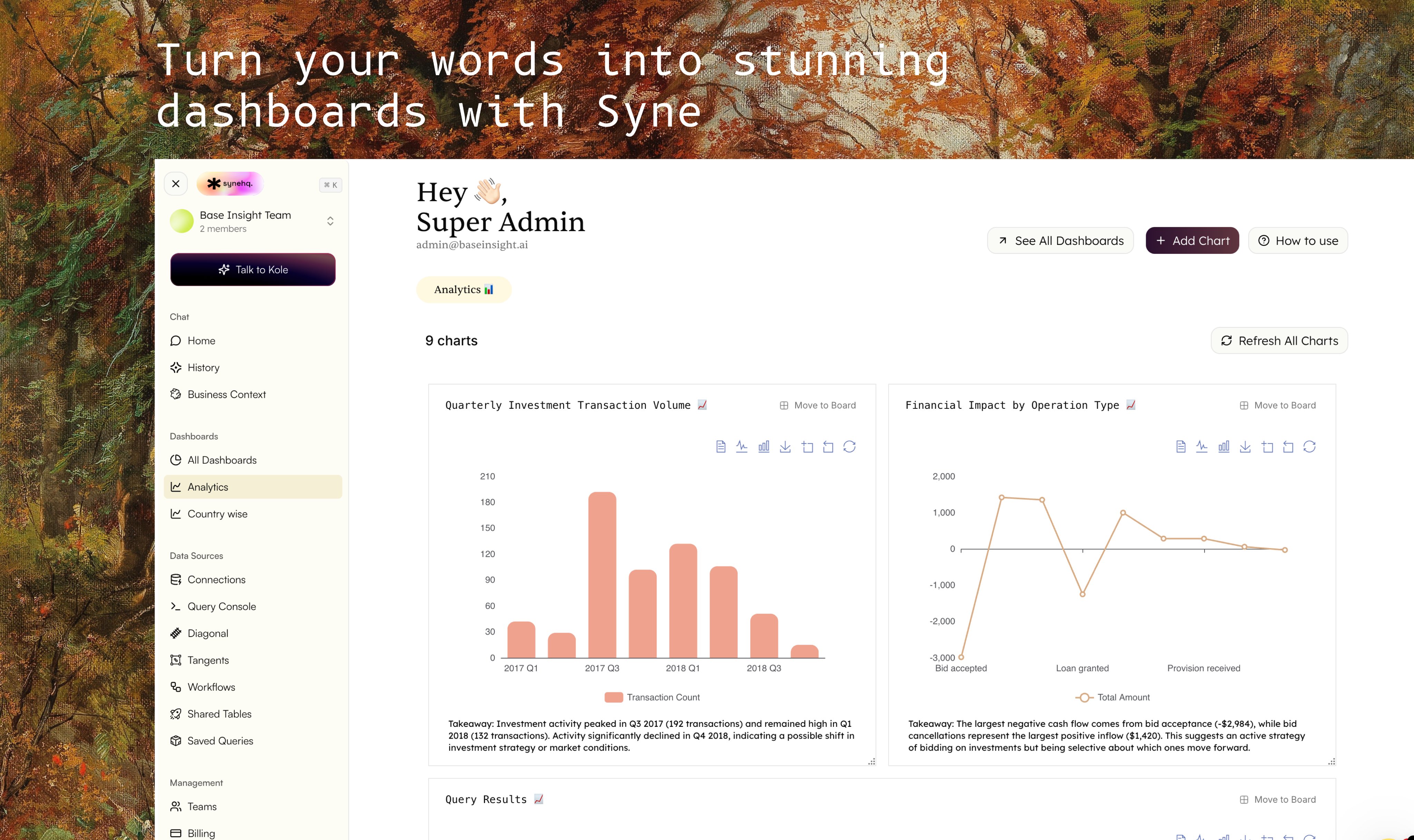
Quarterly Investment Transaction Volume
- Chart: Vertical bar chart with quarterly time axis.
- Legend: Transaction count.
- Takeaway: Highlights peaks and declines in investment activity.
- Usage: Spot inflection points, market strategy changes.
- Chart: Line chart showing cash flow by operation (bid acceptance, loan granted, etc.)
- Legend: Total amount.
- Takeaway: Identifies the largest positive/negative flows and drivers—e.g., bids, provisions.
“Investment activity peaked in Q3 2017 (192 transactions)… Activity significantly declined in Q4 2018, indicating a possible shift in investment strategy or market conditions.”
“The largest negative cash flow comes from bid acceptance (−$2,984)… This suggests an active strategy of bidding on investments but being selective about which ones move forward.”
FAQ
FAQ
Q: Do I need to know SQL to create charts?
No, SyneHQ’s builder and natural language features allow anyone to build and visualize insights. Advanced users can also edit SQL directly.Q: How do I organize multiple visualizations?
Use Dashboards and Boards to group, organize, and refresh related charts.Q: What if I want to present my findings?
Each chart and its narrative can be exported or embedded in presentations, reports, and emails.Q: Can charts update with new data?
Yes, use Refresh All Charts to fetch the latest numbers across your dashboards.